In last tutorial of Basics of Layer we learn about layers and working of layer panel. Now we will come up to some interesting options of layer.
Wanna add style to your creations, shape or text?
Wanna add some depth to your objects?
Here we have Layer Style in layer panel by which you can give style or some effect to your images or creations. These styles can be applied to any type of layer whether it is rasterize, text or shape. These styles work magically, without much efforts you can take your creation to a next level.
Usually you notice glow, shadow or outline on graphics and text, most of the time designer use Layer Style only.
May be it looks like a shortcut, but every style or effect have some options by which you can have all controls over the setting of effects or style. Like you can control in which direction shadow have to be cast , or how much a shadow have to be sharper.
So let us directly jump to its working.
You can see ƒx written on its icon which usually denotes Effects.You will find its icon in bottom side of layer panel.
When you click this icon you can see some options. These options are different type of layer styles or you can say effects. Every effect has different options to control it. There is a separate window for layer style from where you can see all option of each effect and can select or deselect effects from there only. As explained in Basic of layer tutorial you can make it visible or invisible by clicking eye.
Let us learn these styles with some examples
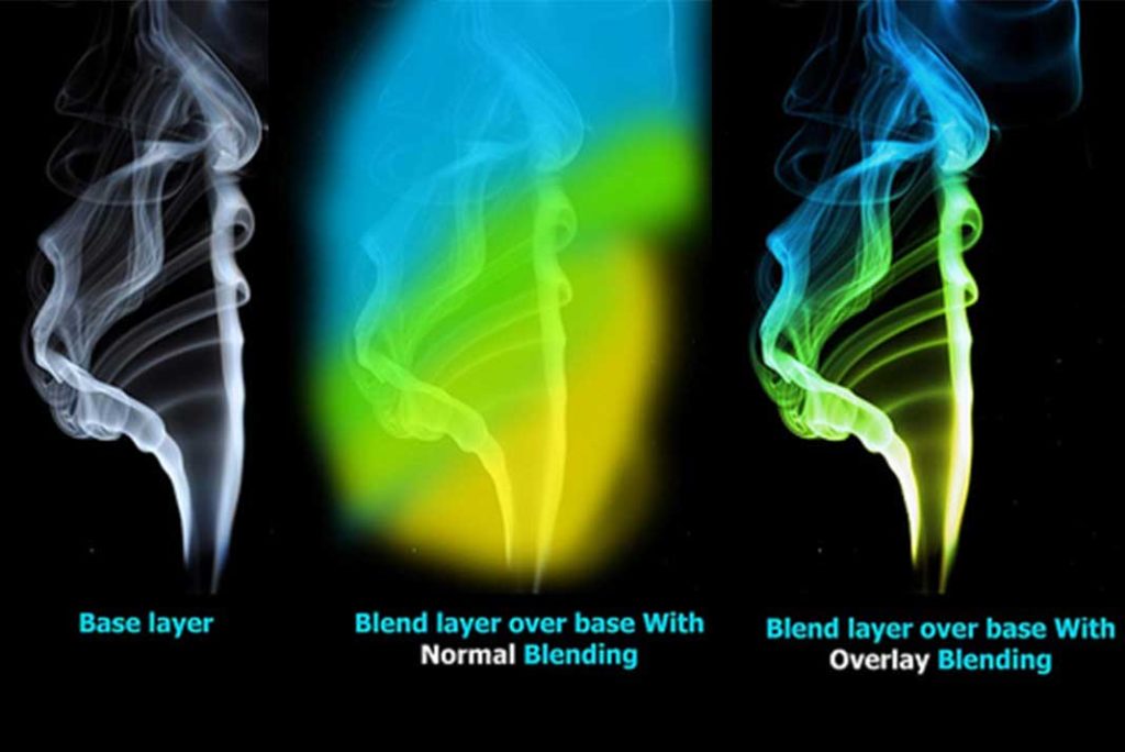
Glow Layer style is layer style which is frequently used in graphic works. Here is an example of outer glow. It will give better results on dark back grounds. You can play with its options to have desired output.
Now I will quickly show you an effect with Outer Glow and Contour option in its quality section.
I just change its contour and have some new Text effect.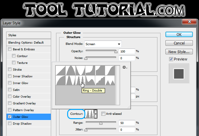
Motive of this is to encourage you to play with these options, As this is a basic Course we don’t want to get you confuse but will be get back to you with Effects and get updated by Subscribing our Youtube Channel.
Here is another example to show some styles
Here I am using shape from our logo of TOOLTUTORIAL.com, now I have to give some depth some shadow to enhance it and make it ready to look as our logo.

Now I want some embossed effect on it, so I will choose Bevel and Emboss from layer style list.
When you click it you can see a new window of layer style with an active section of bevel and emboss and your shape has been embossed. But game is not over there are lots of options in this layer style window you can play with these options and get desired output. Every option is understandable with its name.

Now here I only increase its depth and other this are as default, but you can change its style technique and play with other options and you will understand its use.
And now you can see all other styles in this window only and you can apply as many styles as you want on a single layer. So now I want some shadow on this shape, so just click on Drop Shadow and Drop Shadow will be active and you can see its option straight away on Layer style window.
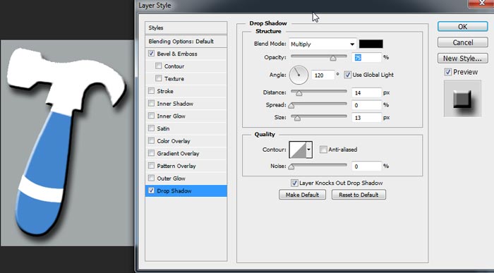
Here we have our output with shadow. In this I increase distance to make shadow visible and play with its size to make shadow smoother. You can also change angle, opacity etc to get your desired output.
Here are more options like Color overlay, pattern overlay, satin and gradient overlay. These options works like you are placing something on your object.
For an example you are laminating your book whether it is translucent textured colored or opaque lamination.
Here is a live example of color overlay other will work like this only with some different options. In this image you can see I apply color overlay with Orange color and you can adjust overlay opacity by opacity parameter.
Now one style which will be frequently used is Stroke, it basically add outline to your shape.
Here I give stroke to a text by which you can understand its working. You can change size and color of stroke. Can define its position and like all other can play with options.
Here we get some basic overview of layer style which is enough to give a start to your creative ideas.
TUTORIAL IN DEPTH
All layer styles are explained individually in details.
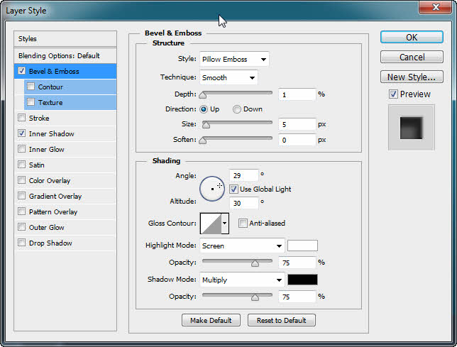
Bevel and Emboss : Bevel and emboss is one of the widely used layer styles, As it names tells about it, that by this style plane graphic will be embossed. What it actually do is that , it adds Highlight and shadow on a plane graphic, because ever you think that if we have no highlight or shadow and have only single tone, then we will seems to be a plane sheet. So to add a depth in a plane area we add bevel and emboss, It have many options.
Here below you can see this plan text and text with a depth, I just add bevel and emboss to it and it is just a simple way to add depth and make your text and graphics more appealing.
It also has options like, texture and contour to have much more control over the type and design of depth.
Stroke : We add outlines to text, to graphics for giving them a highlight. Stroke is usually given for showing something different from others. Strokes are used to make cutout images , and many other effects. There are many options to control stroke style.
You can set color of stroke or outline, can set whether it shout be in center of edge, outside or inside edge. You can also control its opacity. By this you can also made frame on edges of your virtual canvas, actually you can do tons of experiment with each of Photoshop feature and at last you come up with your own Creativity so never hesitate to experiment It will not blast Like a chemistry experiment 😉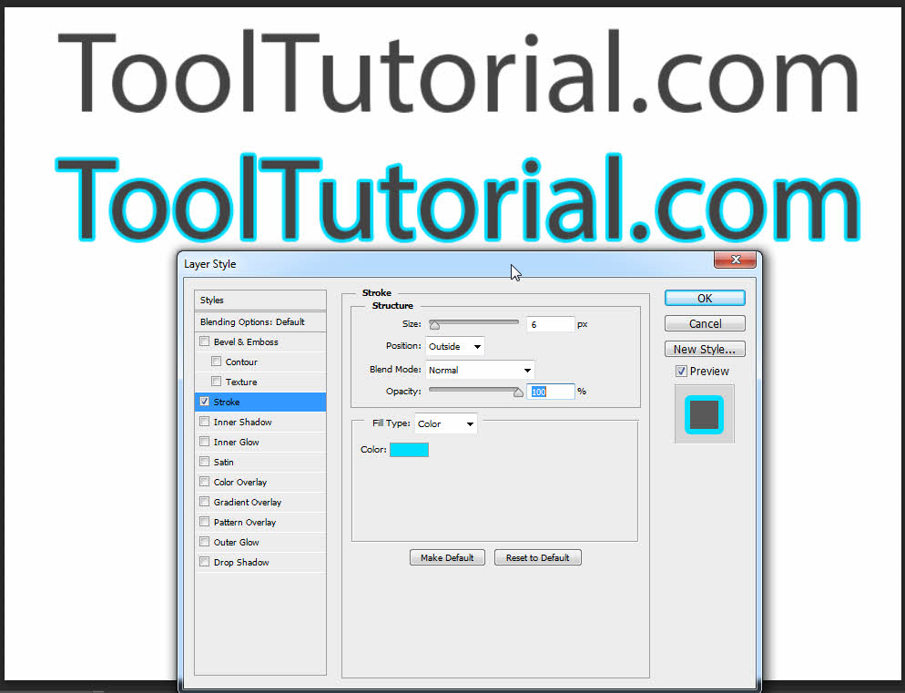
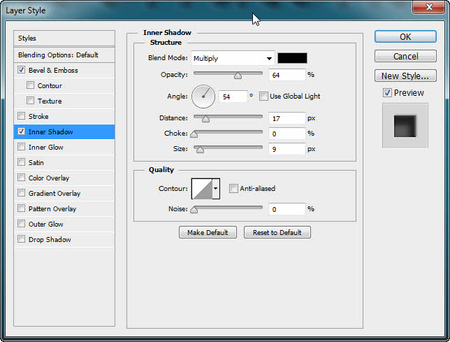
Inner Shadow : Traditionally inner shadow is used to create a 3D depth in a 2D object. When you see deep in a well, its depth is created by its inner shadow. You can also use it to show something like a cutout. Like in art and craft work when we have a shape cutout in a paper , and background color is same as paper’s color, at that time cut out is identified by the shadow. So to create that effects virtually we have inner shadow layer style in Photoshop layer style.
This effect can also used on text and by this you can make different text effects.
Again there are lot of controls to explore your creativity in your own way. Use it in a hit and trial method, experiment with all these layer styles use them combined and come up with some eye catching effect.
Here below we have an image in which firstly apply bevel and emboss and then inner shadow. This is an easy two steps text effect, like this only you can change your boring text or graphics into some stunning ones with an ease.
Below I also gave two images of bevel and emboss , and inner shadow settings.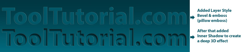
 Inner Glow : Inner glow is another layer style, used in graphics for a long time. What technically it does is that it add transition shade inside the shape. To show its effect surround should be darker and for me its best result comes out, when glow color is any neon color.
Below you can see example of Inner glow layer style. This is also an 2 step effect. By this you can add highlight to have an metallic look with combination of other Photoshop layer style such as bevel and emboss or you can also use this as neon text effect.
In this chapter we are just learning about these effects, in coming days we will elaborate these layer styles in effects tutorial where we will learn their practical work and combined effect with multiple techniques of Photoshop.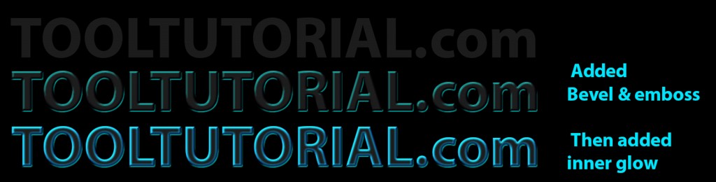
Satin : This is a complex Photoshop layer style, and not that much popular in compare to other layer styles.
But when you work with it, then it will be really fun and useful in many situations. Satin by name it is related to cloth, so you can add depth of cloth in a 2D plane. You can add smooth cloth waves like silk cloth by this satin layer style. More over by satin layer style you can make metallic or glass effects more realistic.
So surely try this layer style, to have some interesting effects, give an extra flavor to your graphics.
Below I am giving an example of satin layer style, I just continue upper effect, and turn text into glassy effect.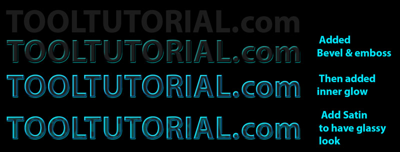
Color overlay : Color overlay is again a useful layer style by which you can add overlay of a specific color. It is an easy way to change color. Color overlay is just like applying a lamination on graphics. But it can’t replace hue and saturation color correction method, don’t mix both techniques.
Using color overlay with full opacity tends to a solid color only. so if you only want impact of a color on your graphic then use it with less opacity. Below I applied color overlay with red color, and text color turns to reddish. Gradient Overlay : Gradient overlay is just like previous layer style color overlay. In this layer style we can overlay gradient other than a solid color. I explained gradient in Painting Chapter. Basic difference between gradient and solid color is that solid color is a single color and gradient is flow of colors.
Gradient color overlay is use to overlay flow of colors on a graphic. You can change colors of gradient by custom settings, and choose from different options.
Below I give example of gradient overlay, I use linear gradient with multiple colors of rainbow “VIBGYOR” learn about colors in Color Chapter.
Pattern Overlay : It is another overlay layer style in Photoshop layer style, that is patter overlay. By this pattern can be overlay on a graphic, it is again very useful to overlay texture on a plain graphic.
You will get many pattern presets, by which you can add texture from a number of textures, you can also set texture size and opacity.
By this you can turn a plain 2d graphic into a crush paper by this texture overlay.
Below I again continue with above example and apply pattern overlay. You can use these layer style on any type of graphic, not only text. I am just giving these examples on text, but you can explore them in any way you want and use them with your own creativity.
Outer Glow : In layer style list it is one of famous layer styles. Outer glow is used traditionally in graphics, it is a technique to highlight something. You can make brightness of moon and sun and just like that any bright object which is lighten, by this glow layer style.
Same like inner glow, outer glow also looks best in dark background.
I advice to use outer glow with neon colors, as i show example in its example image. Adjust its size and spread of glow to have your desire result.
Drop Shadow : One of the most popular layer style among designer is drop shadow. I tell you one secret that in college days we friends use drop shadow on every text or graphics to have some depth, if anything doesn’t looks realistic or good, we say just put drop shadow on it.
So you can use this layer style smartly to have some nice effects. If you want anything to be shown as it is kept on something just use drop shadow.
As to show lighting and effect , drop shadow is a main component. In some layer styles like drop shadow, inner shadow, bevel and emboss which are use to create depth in 2D graphics, one important thing is shading angle, that means direction of light. Sometimes we use same light direction in whole graphic , so we check use global light on layer style of each layer and different layer styles.
But in some effects we need different light angles, so at that time uncheck the global light and adjust it for only that layer. When you change angle of shading with checked use global light, at that time shading angle of all layers and there layer styles are changing which are checked with use global light.
This topic will be elaborate in some complex effect.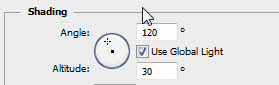
There is one more thing to be understand about layer style is that, every style or effect use pixel of your creation only.
For example : If you want shadow or glow in a text , so it will take outline pixels as reference to create shadow or glow. But sometime you can face a problem, like you have rugged outline of a creation , then its shadow will also that as a reference and I am sure it will not look good.
Here is an advice, in coming tutorial you will learn editing, so while removing background of an image, for example removing background of your own image.
Use pen tool for selection, other than quick or magic selection tool if you want a smooth layer style on it.
It is because pen tool always give a smoother and fine selection than any other selection technique in complex editing.